|
Brief Description
This unit investigates broadly how children spend their
leisure time. Most of the activities are summarized using data
from the class, but a final section compares the class data with
national figures.
Design time: 5 hours.
Aims and Objectives
On completion of this unit pupils should be able to fill in
tally charts, interpret simple statistical tables and to draw and
interpret pie charts and bar charts for categorical data.
They will have practised collecting data, and drawing and
interpreting bar charts for continuous data.
They meet examples of a histogram, and the mode.
They should become more aware of how data are collected and
some of the associated problems and of the difficulties in the
interpretation and comparison of statistics.
Prerequisites
Pupils need to be able to:
- Use tally marks.
- Divide 360 by the number of pupils in the class to the
nearest whole number (or one decimal place, if you want
this accuracy).
- Measure and draw angles (including obtuse angles).
- Know the meaning of the words 'radius', 'sector' and 'axes'.
Equipment and Planning
Section A investigates how children spend their time
and contrasts a school day with a Sunday. Section B
looks at different aspects of what they like doing in their spare
time. Section C compares two aspects of use of leisure
time with national figures. Various alternatives are available in
Section B. Different groups could do different
alternatives and produce a class display for a final discussion
on the unit.
'My Diary' on page Rl covers the time spent reading and
watching television for seven days. It should be filled in before
work on Section B is begun, so seven days warning for the class
is needed.
Section B requires the completion of a questionnaire,
and the recording of class results on tally charts. They can be
completed after the diary and before starting work on the unit so
that the flow of work is not interrupted. It may be helpful to
limit the choice of television programmes in the first question
on the questionnaire.
Section C2 requires the use of the Radio Tlmes, TV
Times or newspapers for 'today' and Saturday. This section can be
done as an individual or class activity, providing there are
sufficient copies. A request on Friday will bring in copies of
last week's journals.
Core material is Al, A2, B1, B2,
B3, C1, C2. B4, B5, B6,
B7, B8 are optionaL The various alternatives
use the same techniques, and the suggestion is that different
groups do the different alternatives to produce a class display
giving more results with less work. C3 is optional for more able
pupils.
Detailed Notes
Section A
This involves the collection of data, raises some problems of
accuracy in measuring how time is spent, the presentation of data
in tabular and graphic form and finishes with a simple pie chart.
Pupils are asked to compare two pie charts and make commonsense
observations.
If the questionnaire and tally charts are not completed before
starting the unit, pupils need to work at approximately the same
rate and finish this section together. The data collection in
Section B can then be a class activity.
A1
With the forecast increase in leisure time because of,
for example, unemployment, shorter working week and the
increasing use of labour-saving gadgets, activities need to be
known and provided for. There are several possible answers, for
example:
- parents, teachers, librarians, authors
- to make proper provision for your needs, to suggest
alternative books you might enjoy, broaden or deepen your
reading, to order additional copies or different titles
by popular authors.
A2
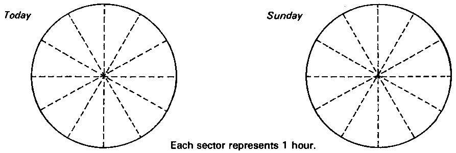
The clock faces are on page Rl. It is wise to avoid too
many categories (use Table 1 as a guide). The problems of
definitions, for example: 'What is "play"?', 'What do
"breaks" count as?' can be treated informally in class
discussion. The hours from the clock face are combined to give
the figures in Table 1, which then give the sectors on the pie
chart.
- should show no school, more play on Sunday.
- *shows usually more work than the pupils' school,
but also less sleep. This is a reinforcement exercise and
can be used for homework.
Section B
This involves simple questionnaire completion. The pupils
summarize data from a questionnaire and present it in tables. Pie
charts are used to show relative proportions. The questionnaire
can be extended to other uses made of leisure time if desired.
Two other possible items are time spent swimming last week
and different indoor games played. A discussion with the
class may well lead to more possibilities. These can then be used
as reinforcement material to parallel B4 to B9.
It can be shown that we need not be too preoccupied with accuracy
for this purpose. Examples are used to show that pie charts are
better for illustrating proportions, and bar charts are better
for frequencies. B8 introduces a histogram.
B1
The questionnaire and completion of tally charts is
probably best done as a class activity. Blank tables drawn in
advance on the blackboard may help. All pupils should have the
completed tables on page R2 handy for the rest of this unit. From
B2 onwards, individual learning is possible. In the
questionnaire completion the choice of daily newspapers needs
care. If local papers are allowed, a comparison with national
figures is not totally relaistic, but it is also unfair to rule
out local papers. A restricted list of television programmes from
which pupils can choose their favourites might help.
B2
Squared paper is helpful. Figure 3 can be used to give
an example of a mode. If this is the first time these pupils have
met a pie chart and their arithmetical ability is low, it may be
helpful to give fictitious data for a class of 36 (or 30 or 24)
pupils.
Taking 360/n to the nearest whole number for the usual class
size makes very little difference to the final appearance of the
pie chart if the sectors are dra wn in increasing order of size.
The error is shown in the following table.
| Class size |
Angle (to nearest degree
per pupil) |
Overall error (degrees) |
| 25 |
14 (141/2) |
+ 10 (-2.5) |
| 26 |
14 |
- 14 |
| 27 |
13 |
+ 9 |
| 28 |
13 |
- 4 |
| 29 |
12 (121/2) |
+ 12 (-2.5) |
| 30 |
12 |
0 |
| 31 |
12 (111/2) |
- 12 (+3.5) |
| 32 |
11 |
+ 8 |
| 33 |
11 |
- 3 |
| 34 |
11 (101/2) |
- 14 (+3) |
| 35 |
10 |
+ 10 |
| 36 |
10 |
0 |
When the pie chart is drawn as described, the overall error
gets included in the largest sector. It is least noticeable here,
and this should be pointed out to pupils.
More able pupils may find it more satisfying to work the angle
per pupil to one decimal place; the final check of adding the
sector angles to see if you get 360o is
then more accurate. Visually, the pie charts differ little.
Pupils need to be told how accurately they are to calculate their
angles. More accurate figures for Creektown School pie chart are
as follows:
360/32 = 11.3 (to one decimal place)
| Title |
Number of pupils |
Angle (degrees) |
| Other |
3 |
34 (33.9) |
| Batman |
4 |
45 (45.2) |
| Dr Who |
5 |
57 (56.5) |
| Bionic Woman |
8 |
90 (90.4) |
| Match of the Day |
12 |
136 (135.6) |
Table 3 (more accurately)
The first pie chart drawn by the class is probably best done
as a class activity. The teacher's (and later the pupils')
judgement is needed for the pie chart radius. Although the
largest sector is approximate, a rough measurement of it can be
made bearing in mind the overall error (see table). Some classes
may benefit from being told that pie charts do not necessarily
have to be drawn in increasing order of sector size. Some
children like to shade or colour the pie chart.
There may be a wide choice of favourite television programmes.
A restricted list from which the pupils may choose their
favourites might help, for example, Match of the Day, Bionic
W'oman, Batman, Dr Who, Starsky and Hutch and Blue Peter.
g and i are most easily
answered from the bar chart.
h and j are most easily
answered from the pie chart.
B3
This section shows 'numbers of viewers out of a known
population', whereas Bl shows proportions, and shows
that some pupils like several television programmes. The
frequencies obtained here can be much higher than those obtained
for 'Favourite programmes'. The modal column is a good indicator
of popularity, and relates to viewing audience figures. There may
be a wide choice of programmes watched regularly. As in B2,
a restricted list from which pupils can choose may help. This
could perhaps be the same as their list of 'Favourite programmes'.
- The data are nominal, so ideally the bars should be
separate.
- For more able pupils. The set of frequencies is not
mutually exclusive, and the pie chart can be misleading.
*B4 - B8
These options give the possibility of getting different
pupils to do different bar/pie charts and to build up a wider
view of the class leisure activities by displaying the charts. It
is suggested that pupils do one of B4 and B5,
followed by one of B6, B7 and B8. More
than this can be done if reinforcement is needed. The instruction
'Write two sentences ......' is to encourage the pupils to
interpret their pictorial representation of statistics.
B9
The class intervals have been carefully chosen to make
the histogram easy to draw. Note that 'exactly 2 hours' goes into
the '2 but less than 4 hours' category. Encourage pupils to
complete their diary as accurately as possible (not rounding to
the nearest 1/4 or 1/2
hour) to minimize this boundary problem. Since all class
intervals are equal, this representation can be considered as
both a bar chart and histogram. Strictly speaking, in a histogram
it is the area of the rectangle that represents the frequency; in
a bar chart it is the height that represents the frequency. Hence
the distinction is unimportant when the class intervals are all
equal and none is open-ended. It may be necessary to choose
different limits for your class intervals if the distribution of
time spent reading is not like the one illustrated.
Section C
This covers simple interpretation and comparison of statistics,
particularly the comparison between class data and national
aggregates. It can be done as an individual, group or class
activity, depending on the number of Radio Times, TV
Tirnes or newspapers available.
C1
This bar chart is similar to that in B9. If you
calculate the class mean viewing time from the original figures
to compare with the published figures, pupils may find this
interesting but difficult. A discussion on 'average' is possible.
Pupils may need help with the class intervals for C1a.
C1d requires an arrow to show the national mean
on the class distribution. This gives a quick visual comparison
of the class and national figures.
The national figures quoted came from surveys carried out for
the BBC.
C2
The programmes from 4.00 to 10.00 p.m. can easily be put
on a pie chart, since this is 360 minutes. The problem of
programmes running from, for example, 9.30 to 10.30 pm may arise
when 4.00 to 10.00 pm is being considered. The problems of
definition have to be faced squarely here. Magic Roundabout
could be considered under 'Comedy' or 'Children's programmes'. It
does not matter what decisions are made, but they must be
consistent and clearly explained in any comment on the figures.
Usually programmes from 4.00 pm to the early evening would be 'Children's
programmes'.
It may be interesting to compare BBC1 with ITV. Different
groups of children could do each. It is left to the teacher to
tell the children which channel to choose. It may be best to use
BBC1 and ITV only for C2a to C2d;
BBC2 programmes often do not begin until later in the evening.
When comparing the whole of the weekday with the whole of
Saturday, different groups could look at ITV and BBC. Different
total hours of broadcasting on the various days and channels mean
that simple pie charts are inappropriate.
*C3
For more able pupils. The pie charts show the proportion
of different newspapers taken and NOT the proportion of families.
This means there is no 'None' category, allowance is made for
families who take more than one paper, and there is direct
comparability with national figures. A true national comparison
with the national daily papers taken can only be made by ignoring
local and evening papers.
National sales are given in the unusual unit 'hundreds of
thousands' to help computation. Social Trends gives the
figures in thousands, and it is usual to quote the figures as
multiples of 103n. The comparison in e
should have some mention of the class not being a representative
sample of the newspaper-buying public. The differences show the
ways in which it is not representative.
Different groups of children could do C3a, c,
e or C3b, d, e.
Answers
See detailed notes.
Numerical answers depend on the answers to the questionnaire.
Test Questions
- Here is how John spent the 12 hours from 6.00am to 6.00
pm on a certain day.
Sleeping 2 hours
Eating 1 hour
School 5 hours
Play 3 hours
Other 1 hour
Draw a pie chart to show this information.
- The 32 pupils in Class 1b at Park House Middle School
gave the following information
| Musical
instrument played |
| Piano |
|
| Recorder |
|
| Trumpet |
|
| Clarinet |
|
| Violin |
|
| Guitar |
|
| None |
|
| Favourite
colour |
| Red |
|
| Blue |
|
| Green |
|
| Yellow |
|
| Orange |
|
- Draw a bar chart to show the musical instruments
played.
- Why is the total greater than 32?
- *Why would it be misleading to draw a pie chart
for these data?
- Draw a pie chart to show favourite colours. (360
/ 32 = 111/4)
- Which colours are the favourite of more than a
quarter of the class?
- The same 32 pupils measured the time spent watching
television last week. Here are their answers in hours.
61/2 12 151/2
18 21 0 3 7 10 14 2 23 9 8 14 17
16 12 3 0 4 5 12 15 18 3 41/2 7 9
11 22 1
- Draw up a tally chart using the categories 'less
than 5 hours', '5 but less than 10 hours', etc.
- Plot your results as a histogram.
- Use the histogram to write two sentences about
these pupils' television viewing.
- Class 1c at Newtown School decided to find out which were
their favourite animals. They filled in a questionnaire
and recorded their results in a frequency table:
| Animal |
Number |
| Cat |
3 |
| Dog |
10 |
| Lion |
4 |
| Elephant |
3 |
| Rabbit |
5 |
| Horse |
6 |
| Gerbil |
2 |
| Other |
3 |
| Total |
36 |
- Draw a bar chart to show their favourite animals.
- Draw a pie chart to show their favourite animals.
Use your bar chart and pie chart to answer these
questions:
- How many pupils liked rabbits best?
- Which animal was the favourite of more than a
quarter of the class?
- What fraction of the class voted for the most
popular animal?
- What is your favourite animal? If you had been an
extra member of class 1c, how would your answer
have altered:
- your original bar chart
- your original pie chart
Answers
| 2 |
b |
Some pupils play more than one musical instrument. |
| |
*c |
The fractions on the pie chart would not be fractions
of the number of pupils in the class. |
| |
e |
Red, green |
| |
|
|
| 4 |
c |
5 |
| |
d |
Dog |
| |
e |
10/36 or 5/18 |
Connections with Other Published Units from the Project
Other Units at the Same Level (Level 1)
Shaking a Six
Being Fair to Ernie
Wheels and Meals
Probability Games
Practice makes Perfect
If at first ...
Tidy Tables
Units at Other Levels In the Same or Allled Areas of the Currlculum
Level 2
On the Ball
Opinion Matters
Fair Play
Level 3
Car Careers
Cutting it Fine
Pupil Poll
Multiplying People
Phoney Figures
Level 4
Figuring the Future
Sampling the Census
Equal Pay
Retail Price Index
Smoking and Health
This unit is particularly relevant to: Humanities, Social
Sciences, Mathematics.
Interconnections between Concepts and Techniques Used In these Units
These are detailed in the following table. The code number in
the left-hand column refers to the items spelled out in more
detail in Chapter 5 of Teaching Statistics 11-16.
An item mentioned under Statistical Prerequisites needs to be
covered before this unit is taught. Units which introduce this
idea or technique are listed alongside.
An item mentioned under Idea or Technique Used is not
specifically introduced or necessarily pointed out as such in the
unit. There may be one or more specific examples of a more
general concept. No previous experience is necessary with these
items before teaching the unit, but more practice can be obtained
before or afterwards by using the other units listed in the two
columns alongside.
An item mentioned under Idea or Technique Introduced
occurs specifically in the unit and, if a technique, there will
be specific detailed instruction for carrying it out. Further
practice and reinforcement can be carried out by using the other
units listed alongside.
| Code No |
Statistical
Prerequisites |
|
|
| |
None |
|
|
| |
Idea or Technique Used |
Introduced in |
Also Used in |
| 1.1a |
Census from small population, simple
data |
Wheels and Meals
Sampling the Census |
Practice makes Perfect
Cutting it Fine |
| 1.2a |
Using discrete data |
|
Phoney Figures
Sampling the Census
Shaking a Six
Wheels and Meals
If at first...
Fair Play
Car Careers
Multiplying People
Figuring the Future
Retail Price Index
Being Fair to Ernie
Probability Games
Tidy Tables
Opinion Matters
Cutting it Fine
Equal Pay |
| 1.2b |
Using continuous data |
|
Wheels and Meals
Cutting it Fine
Practice makes Perfect |
| 1.2c |
Problems of classification of data |
Wheels and Meals
Car Careers |
Tidy Tables
Sampling the Census
Pupil Poll
Retail Price Index |
| 1.4b |
Using someone else's counted or measured
data |
Shaking a Six
Tidy Tables
Multiplying People
Sampling the Census |
Car Careers
Retail Price Index
Equal Pay
Figuring the Future
Smoking and Health |
| 2.1a |
Constructing single variable frequency
tables |
Wheels and Meals
If at first...
Tidy Tables
Opinion Matters |
Being Fair to Ernie
Figuring the Future
Multiplying People
Retail Price Index |
| |
Idea or Technique
Introduced |
Also Used
in |
| 1.4a |
Directly counted or measured data |
Shaking a Six
Cutting it Fine
Being Fair to Ernie
Sampling the Census
Fair Play
Retail Price Index |
| 2.2a |
Bar chart for discrete data |
Shaking a Six
Practice makes Perfect
Cutting it Fine
Pupil Poll
Being Fair to Ernie
Tidy Tables
Multiplying People
Sampling the Census
Probability Games
Car Careers
Phoney Figures
Smoking and Heaith |
| 2.2c |
Pie charts, constant radius |
|
| 2.2e |
Bar charts for continuous data |
Wheels and Meals
Practice makes Perfect |
| 2.2f |
Histogram for grouped data |
Cutting it Fine |
| 3.1a |
Mode for discrete data |
Shaking a Six
Phoney Figures
Practice makes Perfect
Sampling the Census
Car Gareers
Equal Pay |
| 5a |
Reading tables |
Shaking a Six
Probability Games
On the Ball
Multiplying People
Sampling the Census
Equal Pay
Being Fair to Ernie
If at first...
Opinion Matters
Phoney Figures
Retail Price Index
Wheels and Meals
Tidy Tables
Car Careers
Figuring the Future
Smoking and Health |
| 5b |
Reading bar charts, histograms, pie
charts |
Being Fair to Ernie
Car Careers
Phoney Figures
Wheels and Meals
Cutting it Fine
Smoking and Health
Tidy Tables
Multiplying People |
| 5c |
Reading time series |
Car Careers
Phoney Figures
Cutting it Fine
Figuring the Future
Multiplying People |
| 5v |
Inference from tables |
Shaking a Six
Tidy Tables
Cutting it Fine
Figuring the Future
Smoking and Health
Wheels and Meals
On the Ball
Multiplying People
Sampling the Census
Equal Pay
Practice makes Perfect
Car Careers
Phoney Figures
Retail Price Index |
My Diary
| |
Sun |
Mon |
Tue |
Wed |
Thurs |
Fri |
Sat |
Total |
| Time reading (hours and minutes; not schoolwork) |
|
|
|
|
|
|
|
|
| Tme watching TV (hours and minutes) |
|
|
|
|
|
|
|
|
Questionnaire
What is your favourite television programme?
Which programmes do you watch regularly?
Which sport do you most enjoy playing?
Which sport do you most enjoy watching?
Which musical instrument (if any) do you play?
Which club or young people's organisation do you belong to (if
any)?
What are your other hobbies?
How many hours did you spend reading last week?
How many hours did you spend watching television last week?
Which national daily newspaper(s) is taken by your family?
Which Sunday newspaper(s) is taken by your family?
Section A2
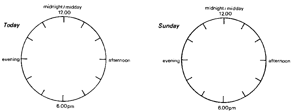
Pie Chart
Results Of Questionnaire
Table 8 - Favourite television programme
Table 9 - Favourite television programme in
order of popularity
Table 10 - Television programmes watched
regularly
Table 11 - Favourite sports to play
Table 12 - Favourite sports to watch
Table 13 - Musical instrument(s) played
Table 14 - Clubs belonged to
Table 15 - Hobbies
| Time in hours |
Tally |
Number |
| less than 2 |
|
|
| 2 but less than 4 |
|
|
| 4 but less than 6 |
|
|
| 6 but less than 8 |
|
|
| 8 but less than 10 |
|
|
| 10 but less than 12 |
|
|
| 12 but less than 14 |
|
|
Table 16 - Time spent reading
| Time in hours |
Tally |
Number |
| less than 5 |
|
|
| 5 but less than 10 |
|
|
| 10 but less than 15 |
|
|
| 15 but less than 20 |
|
|
| 20 but less than 25 |
|
|
| 25 but less than 30 |
|
|
| 30 but less than 35 |
|
|
| 35 but less than 40 |
|
|
| 40 but less than 45 |
|
|
Table 17 - Time spent watching television
Table 18 - National daily newspapers taken
Table 19 - Sunday newspapers taken
Section C Television Programmes
| Type of programme |
Tonight 4.00-10.00 pm (minutes) |
| News and current affairs |
|
| Comedy and variety |
|
| Plays and films |
|
| Sport |
|
| Children's programmes |
|
| Regular series |
|
| Other |
|
Table 20 - Channel:
| Type of programme |
Today - all day (hours and minutes) |
Saturday - all day (hours and
minutes) |
| News and current affairs |
|
|
| Comedy and variety |
|
|
| Plays and films |
|
|
| Sport |
|
|
| Children's programmes |
|
|
| Regular series |
|
|
| Other |
|
|
Table 21 - Channel:
|