|
Class Facts

Collecting the Information
Local councils need to know where children live. Facts about
pupils help with school planning.
Numerical facts are called STATISTICS.
Some statistics collected by schools are:
- The number of pupils
- How old they are
- Where they live
- The number of examinations entered and passed
- Food and fuel used
- The number of teachers employed
| a |
Choose one of these statistics.
Write down why it might be needed. |
You are going to spend some time finding out what your class
is like.
| b |
Fill in the class data sheet. |
You will need a copy of the class data sheet for yourself.
Your teacher will organise this.
Page R1 is a summary sheet for the class's answers.

Travel to School
You will need the class data sheet and page R1.
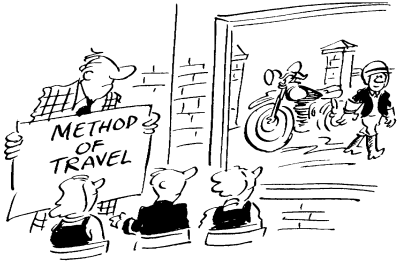
You will find out how your class usually travels to school.
Teachers need to know this if a school trip is arranged.
Table 1 shows the figures for Class 1Z in Wombleshire School:
| Usual method of travel |
Walk |
Cycle |
Car |
Bus |
Other |
| Number of pupils |
10 |
4 |
8 |
6 |
2 |
Table 1 - 1Z Wombleshire School. Travel to school.
| a |
What does 'usual' mean?
If a pupil comes by bus and walks from the bus stop, in
which will you count him? |
| b |
Using the facts in your class
data sheet, complete Table 6 on page Rl. |
If we let R stand for one pupil, then Class 1Z at Wombleshire
School would have a pictogram like Figure 1.
Key  = 1
pupil = 1
pupil
Figure 1 - Class 1Z Wombleshire School - Travel to school.
Notice that all the symbols are the same size and are equally
spaced.
| c |
Draw a pictogram to show how the
pupils in your class travel to school. |
Make sure that your pictogram has a title, and you have given
a key to your symbols.
A pupil in Class 1Z at Wombleshire School wrote:
- 'More children walk to school than travel by any other
method. Four more children travel by car than cycle to
school.'
| d |
Write down three similar
statements about your class. |
Susan is a pupil at Wombleshire School. She drew a pictogram
like this:
| e |
Write down two ways in which
Susan's pictogram is misleading. |
Distance from School
You will need the class data sheet and page R1.
Look at the class data sheet.
| a |
Which colour band do you live
in?
How far is this from school? |
| b |
Which colour band is nearest to
school?
How far is this from school? |
| c |
Which colour band is farthest
from school?
How far is this from school? |
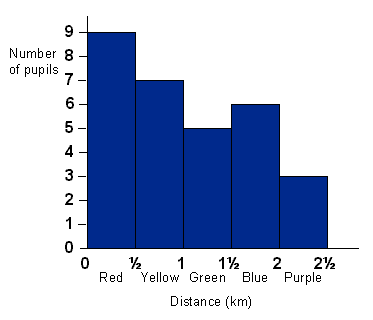
You can draw a bar chart to show the figures. Table 2 and
Figure 2 show the results from Wombleshire School.
| d |
Use your figures to fill in
Table 7 on page R1.
Use a tally mark for each pupil. |
| Colour bandv |
Distance (km) |
Tally |
Frequency |
| Red |
up to 1/2 |
  |
9 |
| Yellow |
from 1/2 to 1 |
  |
7 |
| Green |
from 1 to 11/2 |
 |
5 |
| Blue |
from 11/2 to 2 |
  |
6 |
| Purple |
from 2 to 21/2 |
 |
3 |
(Tally marks are entered, one for each pupil:  represents five pupils.) represents five pupils.)
Table 2 - Class 1Z Wombleshire School. Distance from school

Figure 2 - Class 1Z Wombleshire School. Distance from school
| e |
Draw a bar chart. To do this,
follow the instructions given below:
| 1 |
Draw a line across your
paper, near the bottom. |
| 2 |
Mark off five equal
lengths. Label them in order of distance by
colour band. |
| 3 |
Draw a line up the
left-hand side of the page.
Label it 'Number of pupils'. |
| 4 |
Find the highest number
in the table.
Ours is 9, so we have marked our vertical line
equally from 0 to 9.
Mark yours similarly up to your highest number. |
| 5 |
Above each colour band
draw a rectangle. The number of pupils tells you
how high to make the rectangle.
The top of the red rectangle is level with the 9,
the yellow with the 7, and so on. |
| 6 |
Give a title to your bar
chart. |
|
Answer f and g about your
class. Say whether your answer comes from the class data sheet or
the bar chart.
| f |
Name two pupils who live in the
green band. |
| g |
Find the colour band with the
largest number of pupils in it. |
This is called the MODE.
| h |
Write down three true statements
from your bar chart. |
| i |
Who might need to know where
pupils live? Why? |
How Long Does It Take to Come to School?
You will need the class data sheet and page R1.
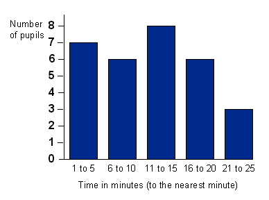
Class 1Z at Wombleshire School found out how long pupils took
to come to school. Their results are shown in Table 3 and Figure
3.
| Time taken in
minutes to the nearest minute |
Tally |
Frequency |
| 1 - 5 |
  |
7 |
| 6 - 10 |
  |
6 |
| 11 - 15 |
  |
8 |
| 16 - 20 |
  |
6 |
| 21 - 25 |
 |
3 |
Table 3 - Class 1Z Wombleshire School, Time taken coming to
school.

Figure 3 - Class 1Z Wombleshire School, Time taken coming to
school
| a |
Use the class data sheet to fill
in Table 8 on page Rl. |
| b |
Draw a bar chart to show your
results. Mark your horizontal axis as shown in Figure 3. |
| c |
Name two pupils in your class
who take less than 10 minutes to travel to school. |
| d |
How many pupils in your class
take less than 10 minutes to travel to school? |
| e |
Write down two statements from
your bar chart. |
| f |
Who might need to know how long
pupils take travelling to school? Why? |
|